Responsive website design is no longer sufficient!
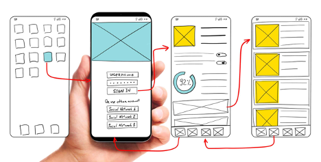
As people’s use of mobile devices grows, mobile-first web design is becoming increasingly vital. This means that your website should be built from the ground up with mobile users in mind, rather than attempting to make it work on both desktop and mobile devices at the same time.
The Importance of a Mobile-First Web Design

The importance of mobile-first web design has grown as more people utilize mobile devices. Mobile devices account for roughly half of all web traffic, according to Statista.
Millennials also use their smartphones for roughly five hours per day. If you want to stay competitive, you need to give your visitors a mobile-friendly experience. Some of the advantages of mobile-first web design are listed below.
A mobile web design reduces the amount of fat material on a website by presenting information in a way that mobile visitors can easily interact with. The Jackson County Public School website, for example, is built with mobile navigation in mind.
Text sizes are also important for readability. Mobile-friendly websites should employ font sizes of at least 16 pixels. The overall user experience would be improved by creating a mobile-friendly website. It will also aid in the ranking of your website in search engines.
The design of a mobile-friendly website should be simple to explore and utilize. Users of mobile devices require information that can be accessed quickly and conveniently. Because the user experience is paramount, it is critical to create mobile-friendly devices.
Use a responsive mobile design and A/B testing on landing pages for improved results. You’ll be able to tell which one converts better and has a higher conversion rate. You may also measure the effects by including the most recent Google Analytics data on your mobile-friendly website.
Concentrate on the content and messaging

Instead of navigating the site to discover information, mobile consumers want to instantly understand the material and messaging you have to provide. As a result, while developing your website for mobile, it’s critical to prioritize content and messaging.
You can achieve this by incorporating photos into your design. Just keep in mind to choose them prudently. Combine bold, vivid colors and natural photographs with clear writing and geometric designs for a striking look. A simple design should direct users’ attention to the most important aspects of your website.
Keep in mind that mobile visitors aren’t as patient as their desktop counterparts while building mobile web design sites. On a laptop, individuals may read content three times longer than on a mobile device, but this is not the case on mobile.
Meanwhile, desktop users can scroll through content, most mobile users will skip long paragraphs and jump to the next section. Focusing on content and messaging is the greatest method to build a compelling mobile experience.
This is exemplified by the Internet of Things. Mobile users are already familiar with wearable devices, but the internet of things will soon include in-car and home devices that must show web pages.
As a result, mobile-first design begins with an information architecture that considers mobile consumers’ needs. Designers will have a limited area for critical functions and messaging due to the usual screen sizes of smartphones ranging from 4.7 inches to 6.5 inches.
Web Design using Images

The importance of images in the mobile experience cannot be overstated. They not only provide interest and information to the rest of the article, but they also support it. Ideas help capture a mobile user’s attention, and if they’re well-chosen, they’ll operate effectively on the device.
In just a few seconds, a website visitor might decide whether or not to stay on a mobile page, thus carefully selecting photos that match the site’s design and content is critical.
The size of an image might change based on the size of the viewport. Images on tiny screens should fill the entire viewport, whereas images on larger screens should only take up a small fraction.
The sizes element is used to specify images in media queries. A viewport width larger than 600px indicates a 25% width, whereas a browser width between 500px and 600px indicates a 50% viewport width.
Because images are the single largest source of page weight, optimizing them can help you save bandwidth and reduce page weight. Using the right picture formats and optimizing them might also help you save bandwidth.
While images are vital, image optimization and file compression should also be considered when selecting images for your mobile web design. The appropriate images can improve your overall site experience while also reducing file size and page load time.
UX is aided by images

Because 85 percent of web users expect the same quality on their phones as on their desktops, using images to support your content and messaging is critical. Here are a few examples of how photos can be used in mobile-first web design.
Although imagery is an important aspect of the user experience, not all images contribute to the overall quality of the experience. Users may become confused and lose interest if an image is chosen incorrectly. Choose acceptable and meaningful images to support the major aims of your product.
Moreover, avoid utilizing decorative photos in your design because they rarely add to the overall quality. Furthermore, users frequently overlook them, which can be aggravating.
Because photos can improve a site’s operation, image quality should be excellent. On a mobile device, the correct images will look great and make the user’s experience memorable.
Photos must be compressed and chosen with care. You must, however, ensure that they are not excessively huge or little. Your site will be responsive if you use the right images.
Engage a Digital Marketing Web Designer

Responsive design mobile-first is a terrific method to keep your website’s appearance and feel consistent across numerous screen sizes in a world where most traffic originates from smaller devices. The majority of adults believe that a mobile version of a website should be as appealing as the desktop one.
Using a web designer whether it’s an app, a website, or a social media platform, a digital marketing web designer firm for mobile-first web design and development is critical for brand success.
Almost half of all shoppers now purchase on their phones, and a bad experience might drive them away. Nike, for example, has recognized the advantages of a mobile-first web development strategy and has built an app to boost customer engagement and income.
Search engines reward businesses with search traffic, which a good website design and digital marketing agency understand. A website designer who is familiar with SEO concepts will be able to assist you with messaging and sales funnel decisions.
Going Mobile-first And Responsive Web Design
Another thing that makes going mobile-first so important is that your website will become more compatible with all different types of platforms on the internet. When making these adjustments, don’t go too overboard.
The site that you see on the mobile device should still be quite similar to the one that will appear on desktop computers as well. With that said, sometimes it can be hard to visualize how exactly a site will look on the desktop when you’re working on a mobile-first design, so give both platforms a test and make any necessary adjustments.
A responsive website design also means that a company’s website is more likely to increase conversions. The perfect mobile-first and responsive web design will assist your bottom line, whether you’re an eCommerce company, a restaurant, or a non-profit organization.
Becoming More Organized And Manageable
Mobile devices are much easier to read because of how they’re designed, and because most content creators like to arrange the text in easy-to-read paragraphs of two to three sentences. Expect most mobile-first sites to be designed in a similar manner.
Digital Marketing Web Designer

Professionals in this field should be transparent and easily accessed by their customers. They should also be capable and allocates enough time, effort, and attention to your digital marketing plans. We operate to satisfy the different and unique needs you and your customers need.
Contact Harold@Mach1websites.com or call (469) 536-8478 if you need a new website or want to refresh an existing one.


